I just got iOS 7 on my iPhone 5 and so far it’s running smoothly. I love the new interface and the flat design makes it look even better than before. There are some flops in this version of iOS but for right now we’re going to talk about the best redesigned apps that Apple has given us.
Messaging:
We first head over to the messaging app because that’s where I mostly spend my time. I first noticed that there wasn’t any sign of that dull grayish blue color at the top, but it was replaced with a pure white banner (where your clock is located) and background with vibrant blue icons at the top left and right.
 When texting someone with an iPhone you get this bright clear-lake blue and when texting someone whose not using an iDevice you can see a very bright lime green color. Another little thing I found nice was that Apple added an animation to the chat bubble that shows up when someone using iMessage is typing; instead of a still image of a bubble, the three dots within the picture light up after one another.
What Apple tried to do with the whole UI of iOS 7 is to make things look like they were sitting on top of each other and to make things look layered, and they succeeded with the messaging app. When you send a message it looks like the bubble is sitting right under the keyboard and you’re filling it with words and when you send the message it comes from behind the keyboard.
One thing I really like about the new Messaging app is that if you’re sending many pictures to someone you can do this to see a list of the pictures along with their thumbnails:
- Select a picture within a text message
- Tap on the icon that has 3 lines on the bottom left
- This is where you get a list of the pictures
Weather:
The weather app is another app that got a major update to it.
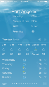
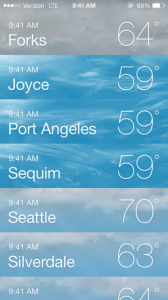
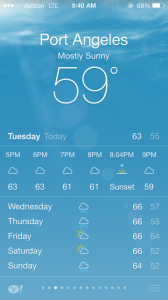
As you can see here, the weather has a different animation for different types of weather (clouds, haze, rain, snow, hail, and thunder/lightning.) When you tap on the degrees you can see the Humidity, Chance of Rain, Wind (and direction of wind), and what it feels like. One little change they made to the app is that you can now see the time of sunrise and sunset based on what city you live in.
Compass:
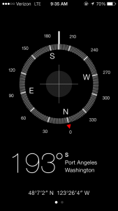 The last app on this list is the Compass app. I never used it and still probably never will but it was given quite an update. For starters, the compass looks cleaner. Back in the later versions of iOS we had that semi-real look with a darkened, glossy wood in the background and what looked to be a sea compass. It was grotesque at best, but Apple revamped the app and now it looks plain and beautiful.
What we have now is a solid black background with white lines that make up the shape of a compass. With the new update you are able to see where you are (Port Angeles, WA) instead of having to go to a 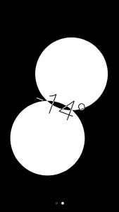 separate place (Maps) to just get a name of your current location like you did in iOS 6.
Apple didn’t just make the look of the compass better though; they even added a separate part of the app that is a leveler. To get to this just swipe left in the compass and you’ll see either two white bubbles if your device is held flat or a half black half white screen with two dashes on the sides if your phone is help straight up.
Conclusion:
All in all, I’m loving iOS 7. It runs great with my phone and it hasn’t been buggy since I started using it. I’m grateful for the overhaul that Apple has done to this iOS and I’ve already gotten used to everything it has to offer. There are so many little things hidden within iOS 7 that it’s too much to cover right now. But we’ll keep putting articles out on it and we’ll try to put as much detail as possible!

